- WPF Metro - Modern UI for WPF
- WPF Metro - MahApps Metro
- WPF Metro - Elysium
- WPF Metro - Elysium Extra
In these series of posts I'm going to do a quick review of a few different open source WPF Metro (Or Modern if you prefer) style SDK's. Each of them provides styles and new controls to build your WPF application from scratch. Here are the home pages for the open source projects in question where you can download the source code and the binaries to play with them yourself:
Elysium Extra
Warning
I am the developer of Elysium Extra. It was developed at the company where I work, where I had an excellent manager who saw the advantage of open sourcing the code and making it widely available to the .NET community.
My intention was to submit this code to the Elysium project, however, the developer had been away for a couple of months, so I released Elysium Extra as a separate project. Happily though, the developer of Elysium has returned and resumed development of the SDK. I've yet to discuss how we can move forward with the two code bases.
This post will be a bit longer as I need to outline the contents of Elysium Extra as it's a new SDK and needs a little explaining (It contains a lot of cool stuff!).
Elysium Extra is an add-on project to Elysium. It fills in some gaps which existed in the Elysium SDK, improves some styles and adds lots of new styles, new controls and style guidelines.
As the code has been used in a real life, large scale application (Albeit heavily modified and cleaned up to make it ready for open sourcing), it should in theory (Fingers crossed) be production quality. It also seems to contain a lot of attached properties and other small bits of code which were found to be required when building a WPF application, that other SDK's do not contain. All of these have demo's in the sample application.
Look and Feel
The look and feel picks up from where Elysium leaves off. Some control styles have been modified and improved, others have been modified for consistency.
The window has be heavily modified to allow full customization. Pretty much every feature you can think of has been added. Changes include Window border glow effects, saving window placement, full screen mode...the list goes on.
Other major differences between this SDK over Elysium are that the TextBox and ComboBox controls have been brought more into line with each other, so if you add them in a form they don't look out of place.
The ability to change theme's is unfortunately currently broken as a side effect of Elysium Extra having to wrap the Elysium XAML styles. This is pretty high up the list of things planned to be fixed though.
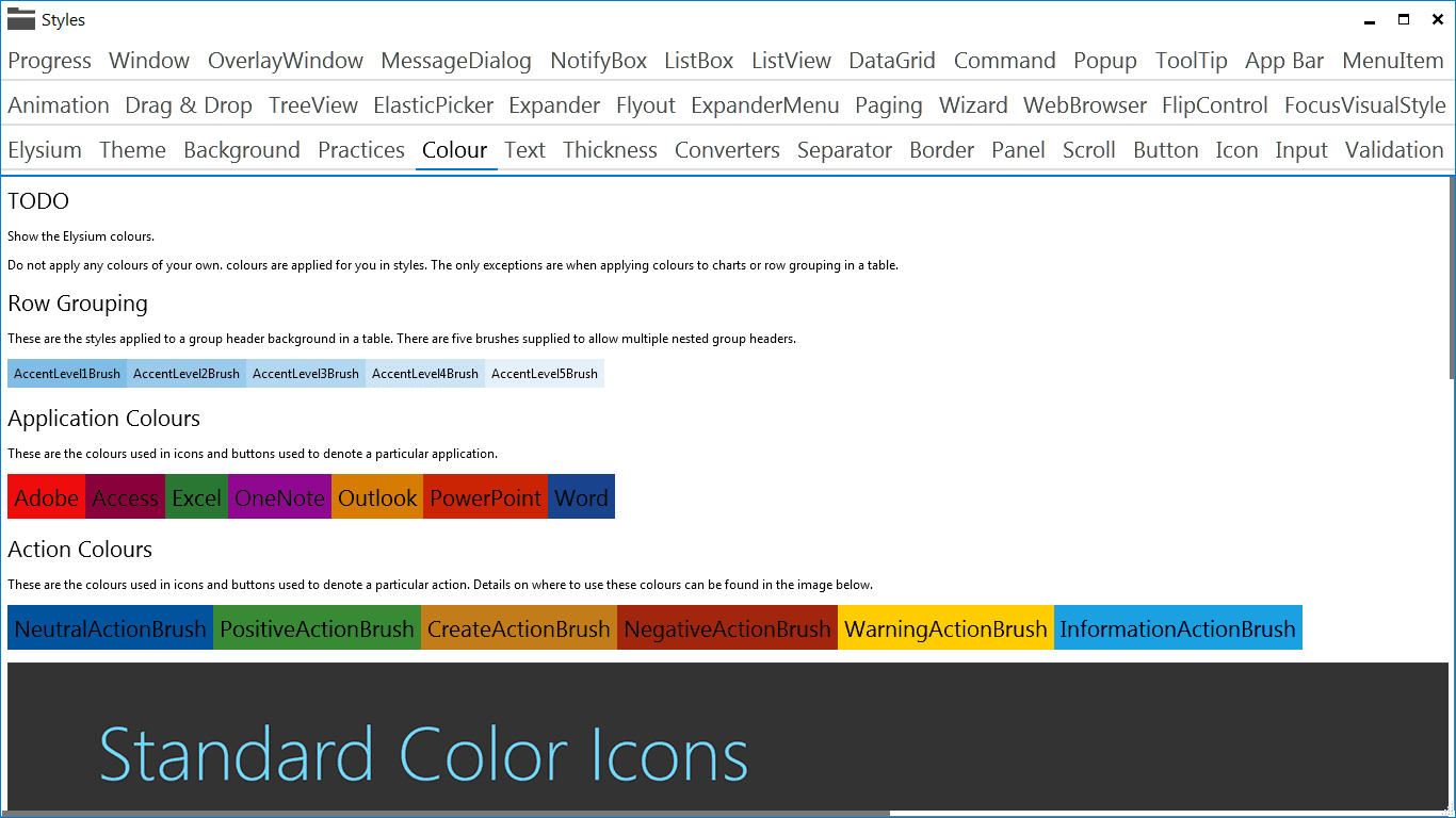
Custom colours over and above what Elysium provides and guidelines on how to use them.
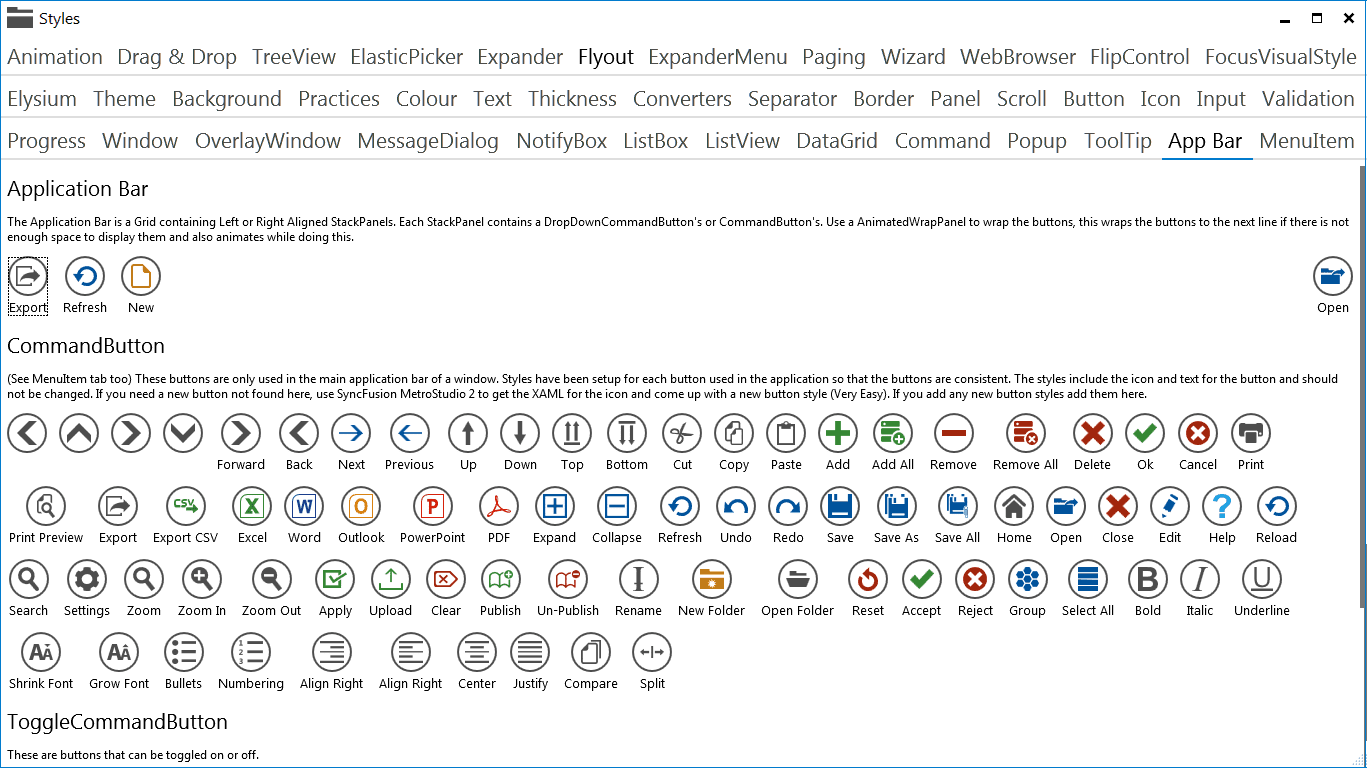
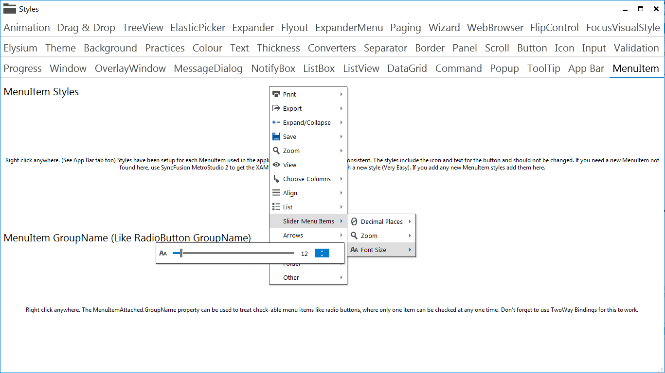
As this SDK has been open sourced from a live application. There are lots of styles for icons, menu items and app-bar buttons. These are things you'd use in every application. Things like cut, copy and paste buttons etc.
Custom Controls
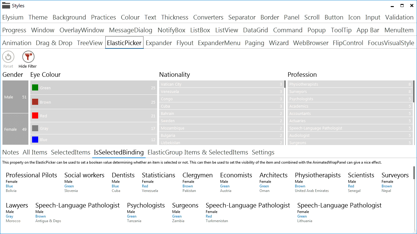
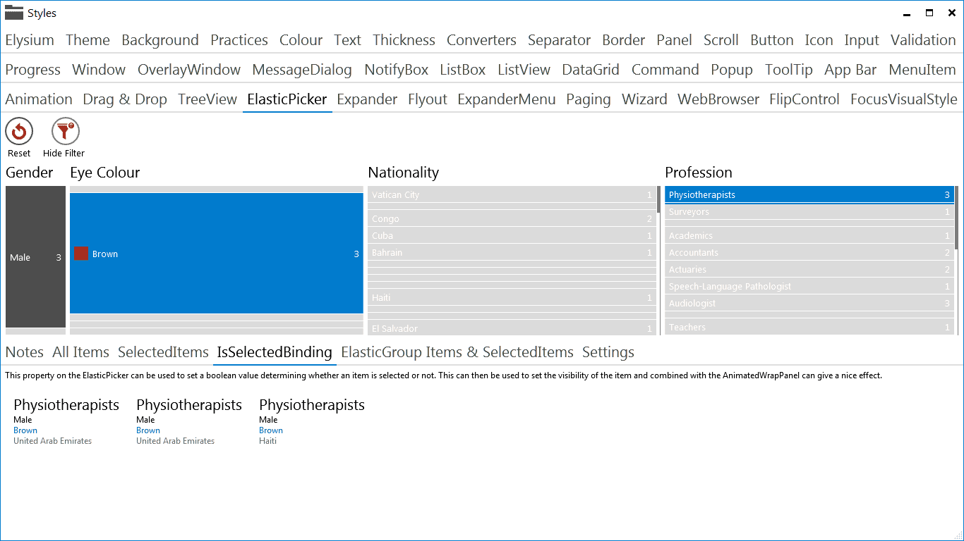
ElasticPicker
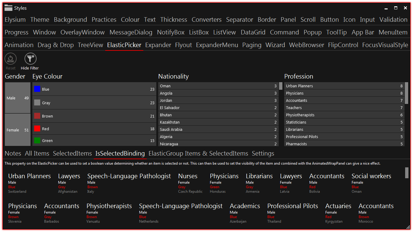
The ElasticPicker is a very unique control that I'm most proud of. It can be used to filter a collection of things with a few clicks, all while looking fantastic and doing lots of flashy animations that will make your eyes light up. The screen-shots do not do it justice, so do watch the video for a better understanding.
In the example below the ElasticPicker is bound to a collection of people and we have given the user the ability to filter based on four attributes of the people. Each attribute shows the number of people in that category, when the use selects a category all the numbers, sizes and colours of all of the other boxes change. It is a sight to behold.
Icon
Icons are ridiculously underestimated in their ability to improve the look and feel of an application and also in the difficulty of getting them right. I've had to use PNG icons in the past and I can tell you finding an off the shelf icon that matches the look and feel of your application and indeed your other icons is hard work. Creating your own icons from scratch is even harder.
With XAML combined with the Metro look and feel though, all this becomes easy. Nearly 3000 icons have been provided out of the box. Icons are a single colour, making them all look consistent and in keeping with each other. Its simple to create your own with the options of Geometry, Text or icons using PNG images using opacity masks.
![]()
Wizard
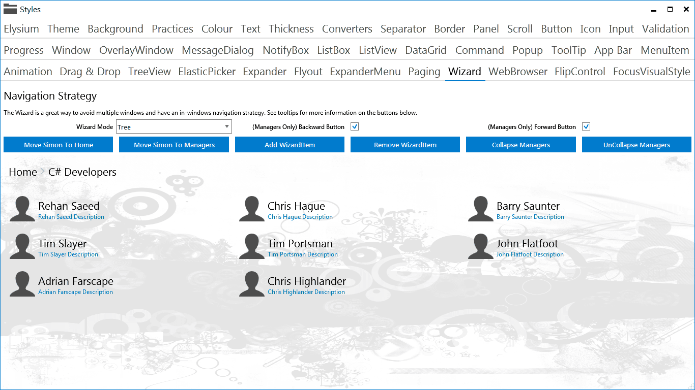
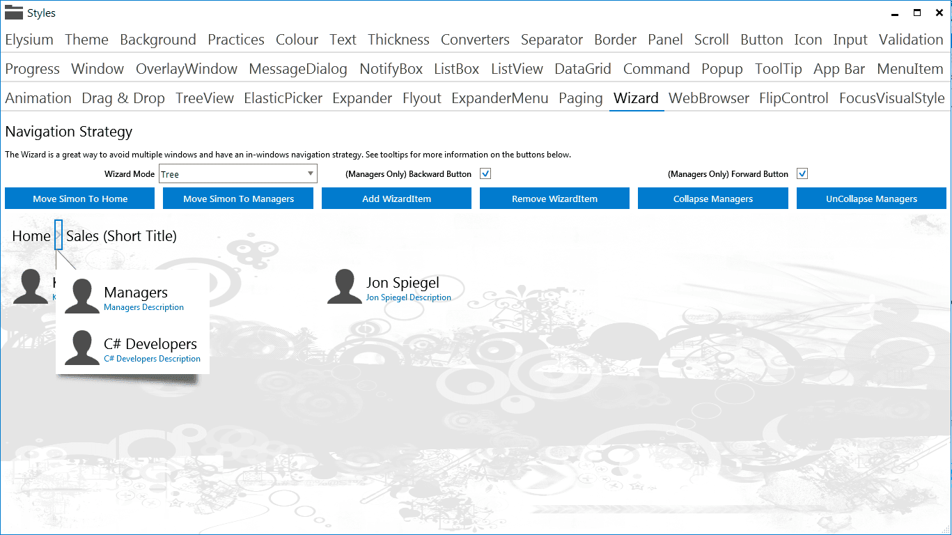
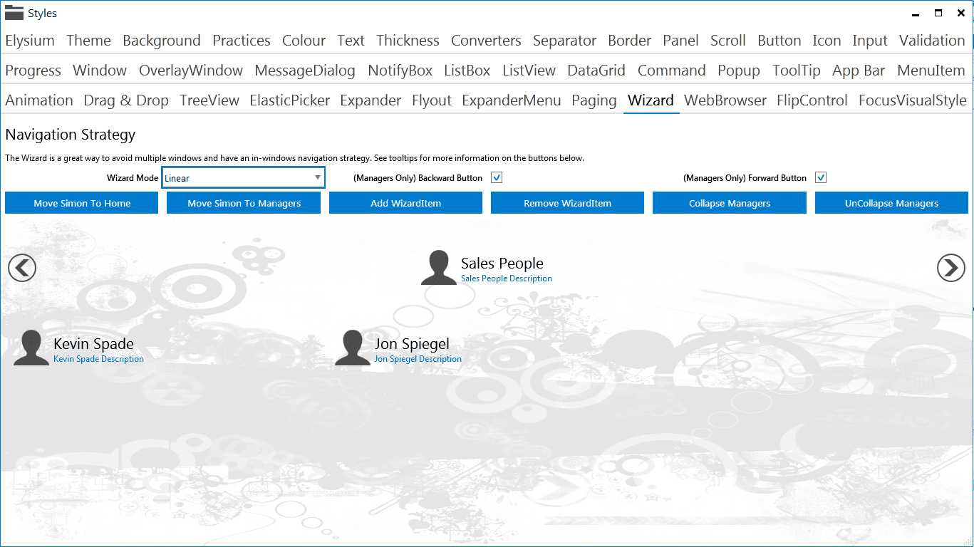
The wizard control is the basis of all my screens. It can be used like the Frame and Page controls in Silverlight or Windows Phone, where you navigate between pages. The difference being that you can optionally structure your pages or WizardItem's into a linear or tree hierarchy and use the breadcrumb navigation bar to navigate between pages.
It gets even better. Each WizardItem supports entrance and exit animations. So when you are moving pages, some really nice transition animations can be applied to any of your controls on the page. If you set backgrounds to your pages, they even fade into each other.
DataGrid
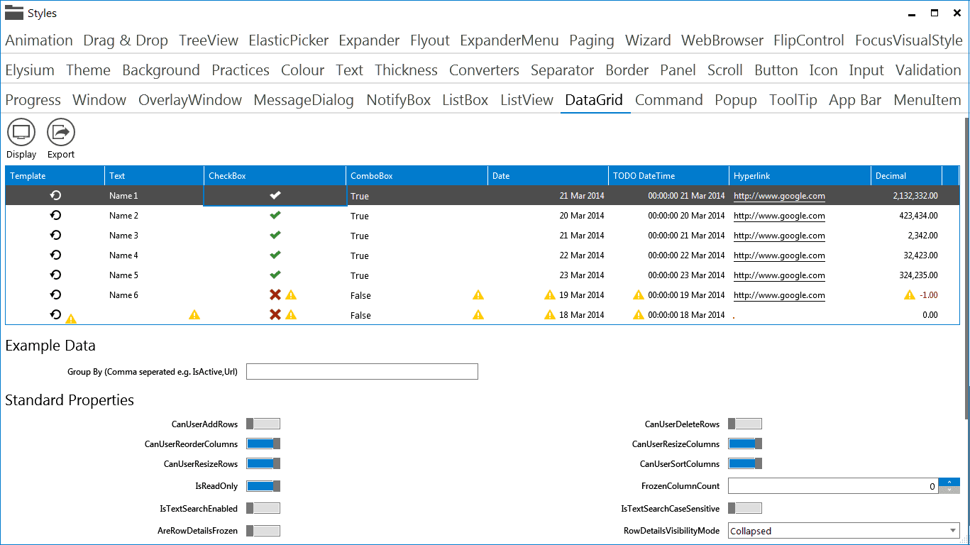
Although not an entirely new control, the DataGrid has been augmented with quite a bit of extra functionality. There are a few new column types like the DataTime and ProgressBar columns. Attached properties have been used to add the ability to add column specific group summaries, save column settings, add single click editing and single click row/cell de-selection among other things.
ExpanderMenu
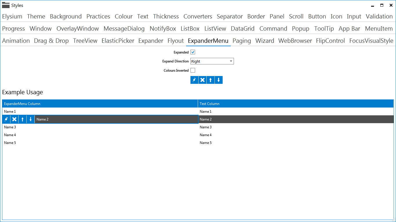
The ExpanderMenu is a great control that a colleague came up with. We've generally used it in the DataGrid. When a user clicks on a row, the ExpanderMenu appears in a nice sliding animation and can be used instead of or in conjunction with a ContextMenu.
Drag & Drop
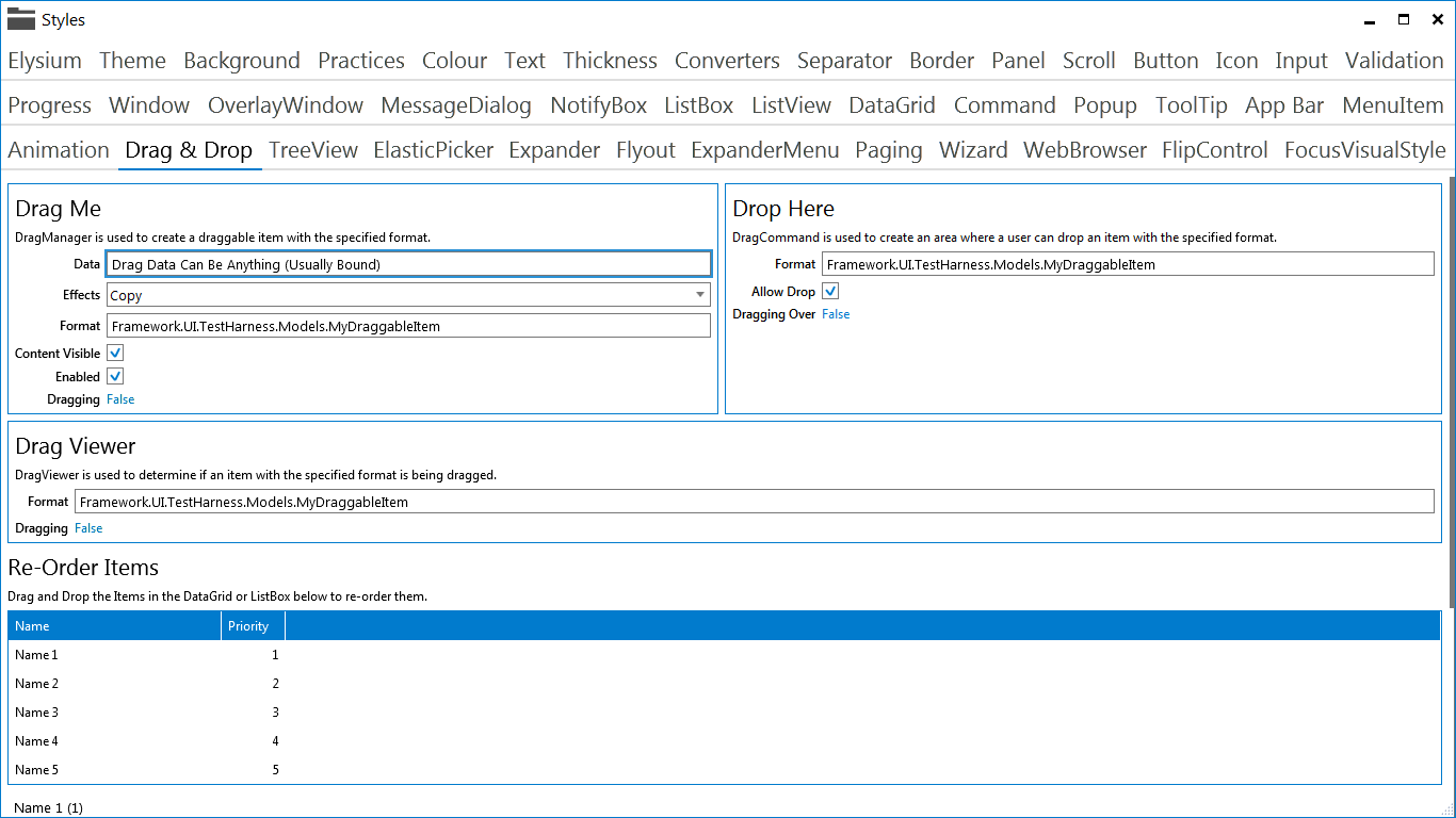
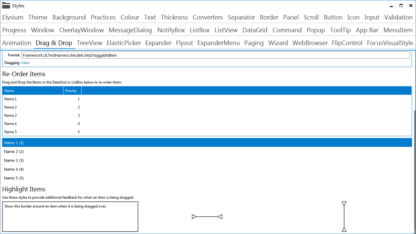
The ability to drag and drop in a completely MVVM friendly method has been added. It is super simple to use and you can get it working with just four lines of XAML! The DragManager is used to make something draggable and the DragCommand is used to fire a standard ICommand. It's super customizable and very easy to use.
Furthermore, styles have been created for the ListBoxItem and DataGridRow which allow re-ordering using drag and drop.
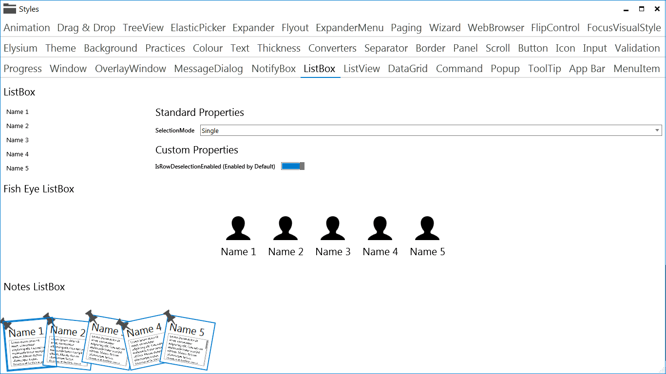
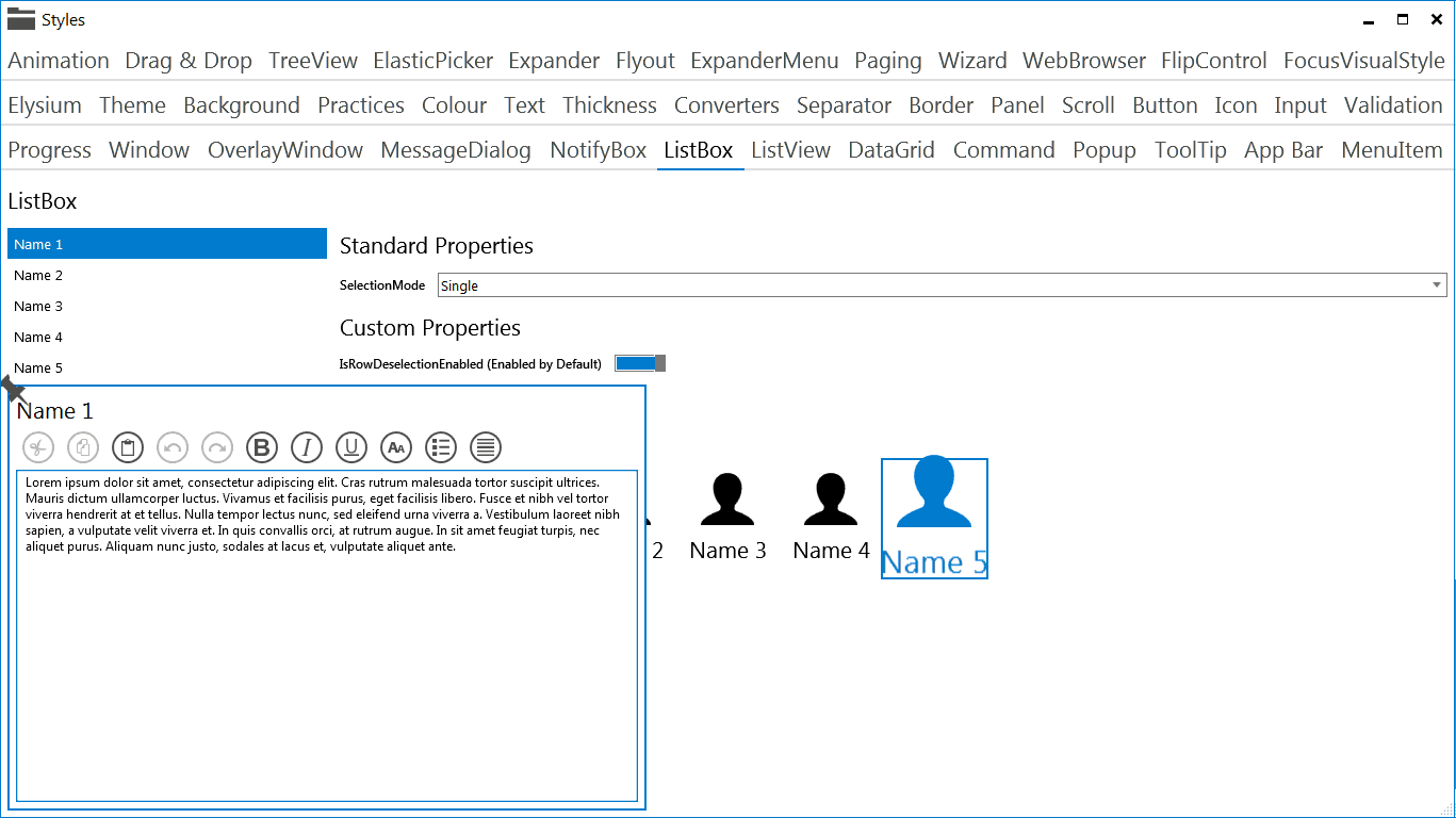
FishEyeListBox and NotesListBox
The Fish Eye list box is just a standard list box, except mousing over or selected in item makes it grow and it gives you a nice top level menu bar. The NotesListBox can be used to display several rich text notes, which expand gradually when you mouse over them.
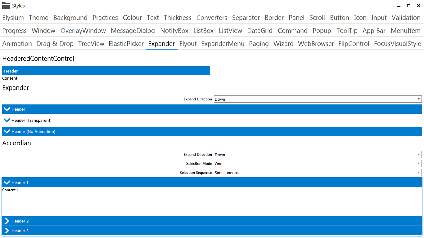
Accordian
The Accordian is a bit like the Expander control, except that you have more than one and can control how may can open at any one time.
The Accordian control has been taken from the left overs of the WPF Toolkit (Buggy controls which did not make it into the proper .NET framework). It has been fixed and totally restyled to resemble the Expander style.
Flyout
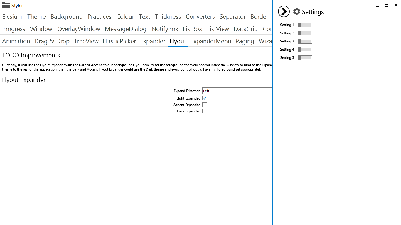
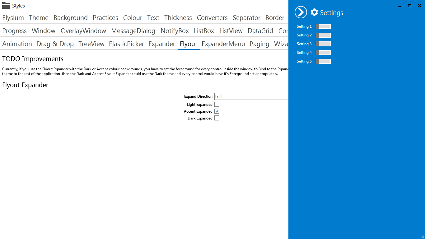
For those that have used the Flyout control in Windows 8, this is very much the same. In the SDK, it's just an Expander control with a custom style (I like to re-use existing controls as much as possible where it makes sense).
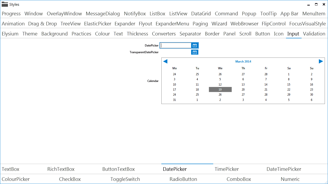
Various Input Controls
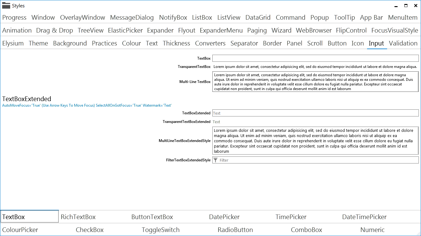
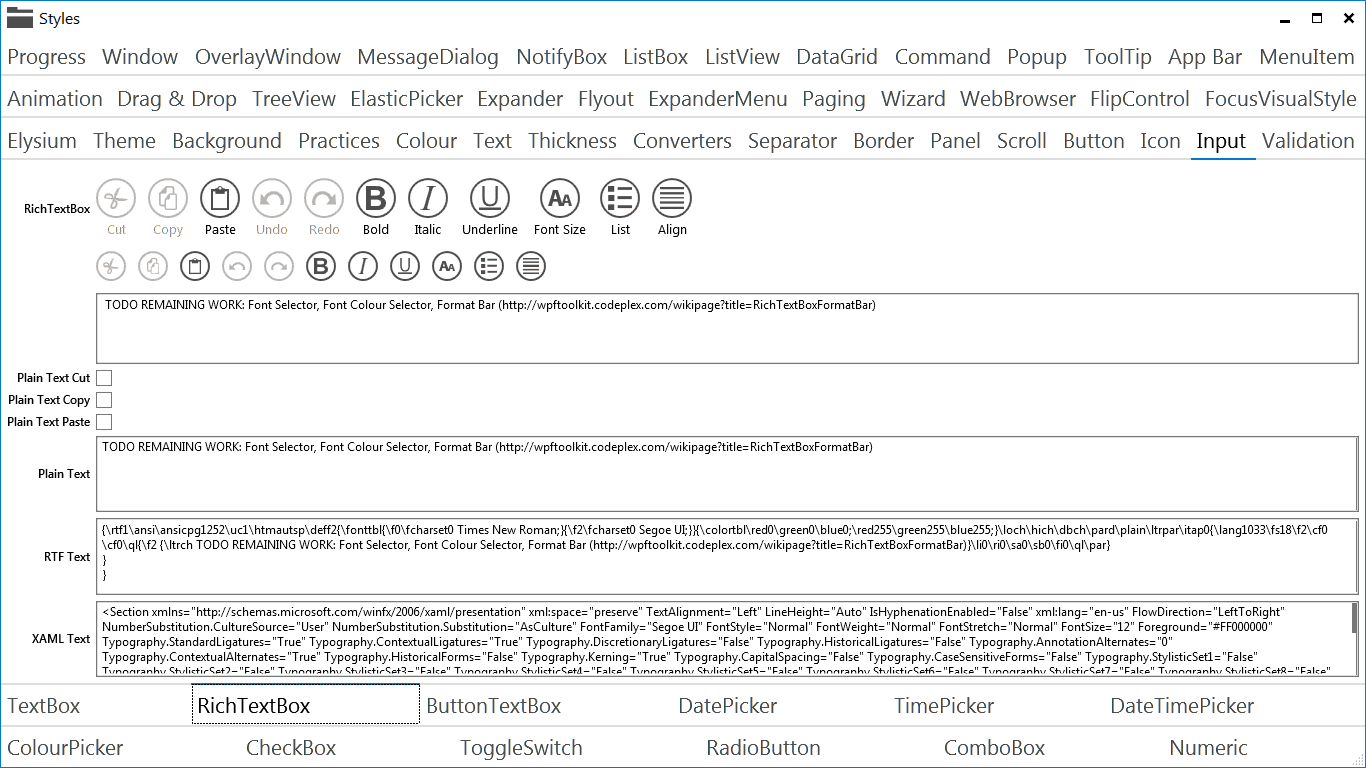
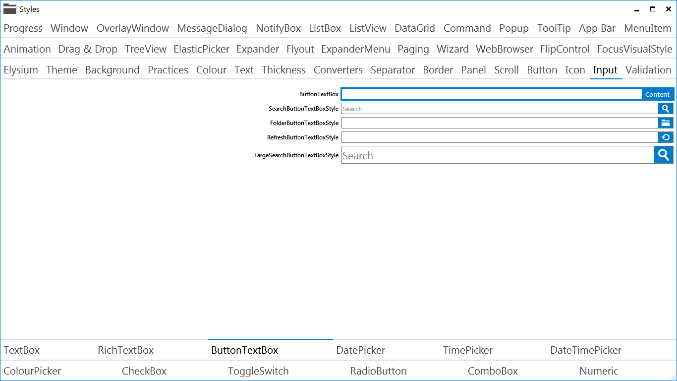
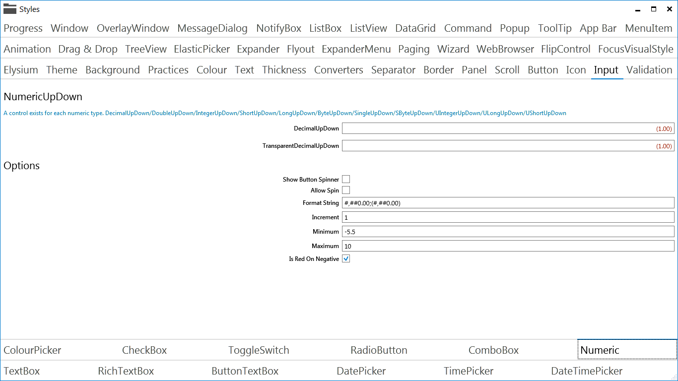
Various input controls have been added or improved. Notable additions include the NumericUpDown controls which allow you to select a number and the ButtonTextBox, which can be used to add a button action to a text box.
Validation
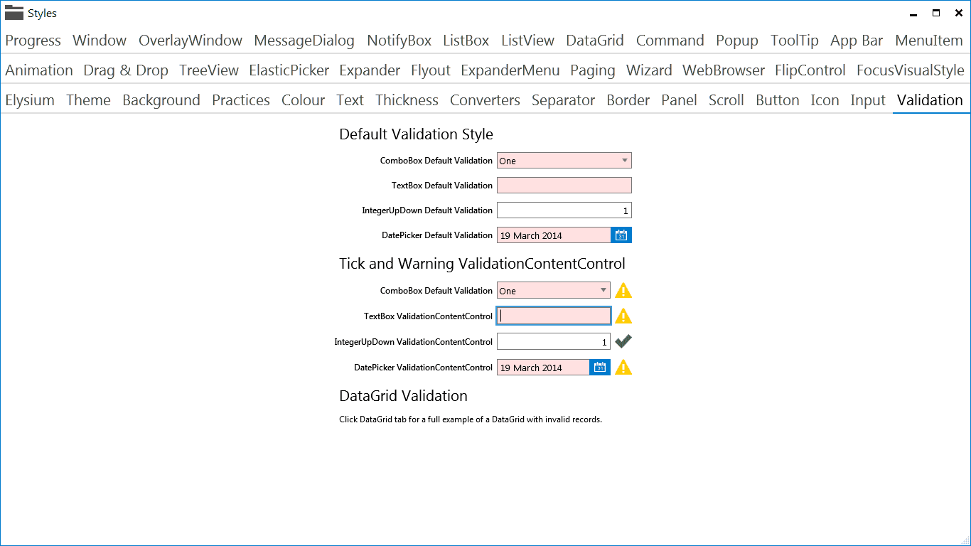
Validation is something that's built into WPF but is so often neglected by people styling controls. So far, this SDK supports validation on the TextBox, ComboBox, DatePicker and numeric up down controls such as IntegerUpDown. I recomend using the INotifyDataErrorInfo interface on your view models or the NotifyDataErrorInfo base class provided in conjunction with these controls.
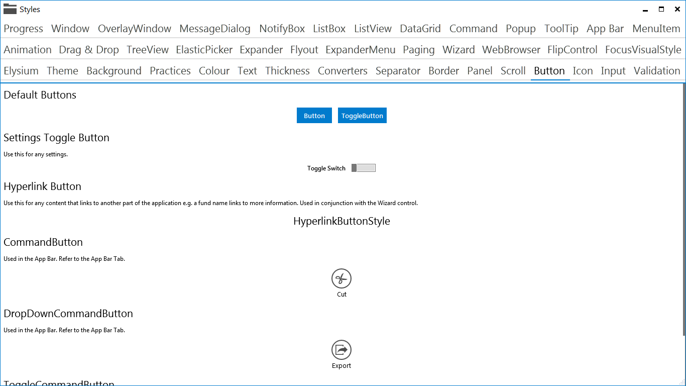
HyperlinkButton
The HyperlinkButton is just a button with a custom style which underlines the text in the button on mouse over and changes the mouse cursor to a hand.
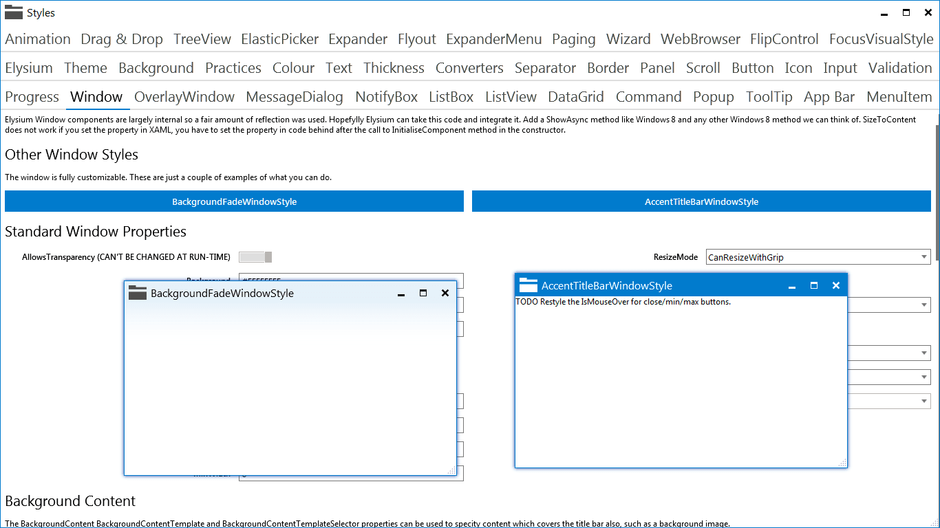
Window
Several new abilities have been added to the window. These include better customization of look and feel, full screen mode, saving window placement, setting the task-bar overlay icon using XAML and/or binding and a custom window drop shadow.
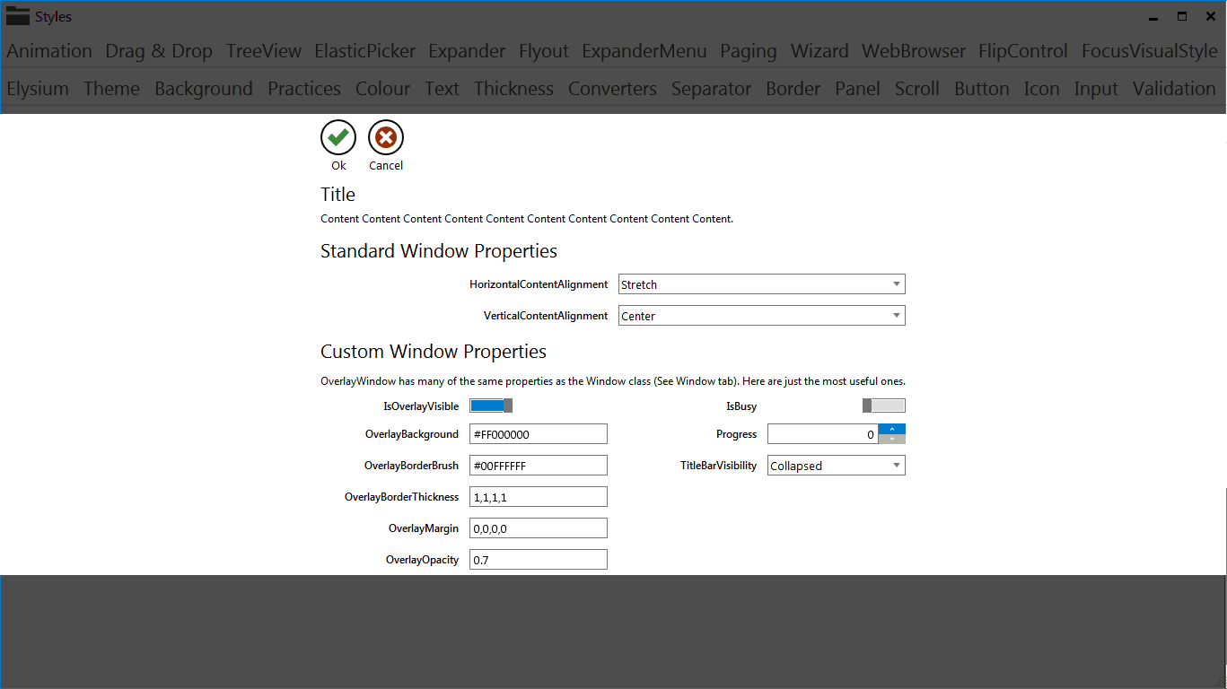
OverlayWindow
This is a special Window which allows you to overlay another window with some content. Crucially this window is not modal but allows modal style interaction with the underlying window.
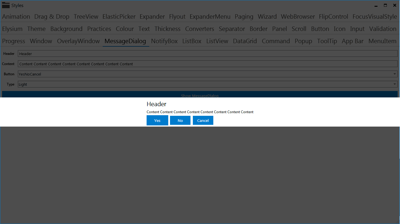
MessageDialog
The standard WPF MessageBox is ugly and uses a really bad design where you can only ask Yes or No style questions. The MessageDialog comes to the rescue with a Windows 8 style dialogue. You can ask any questions and even customize the allowed response buttons.
NotifyBox
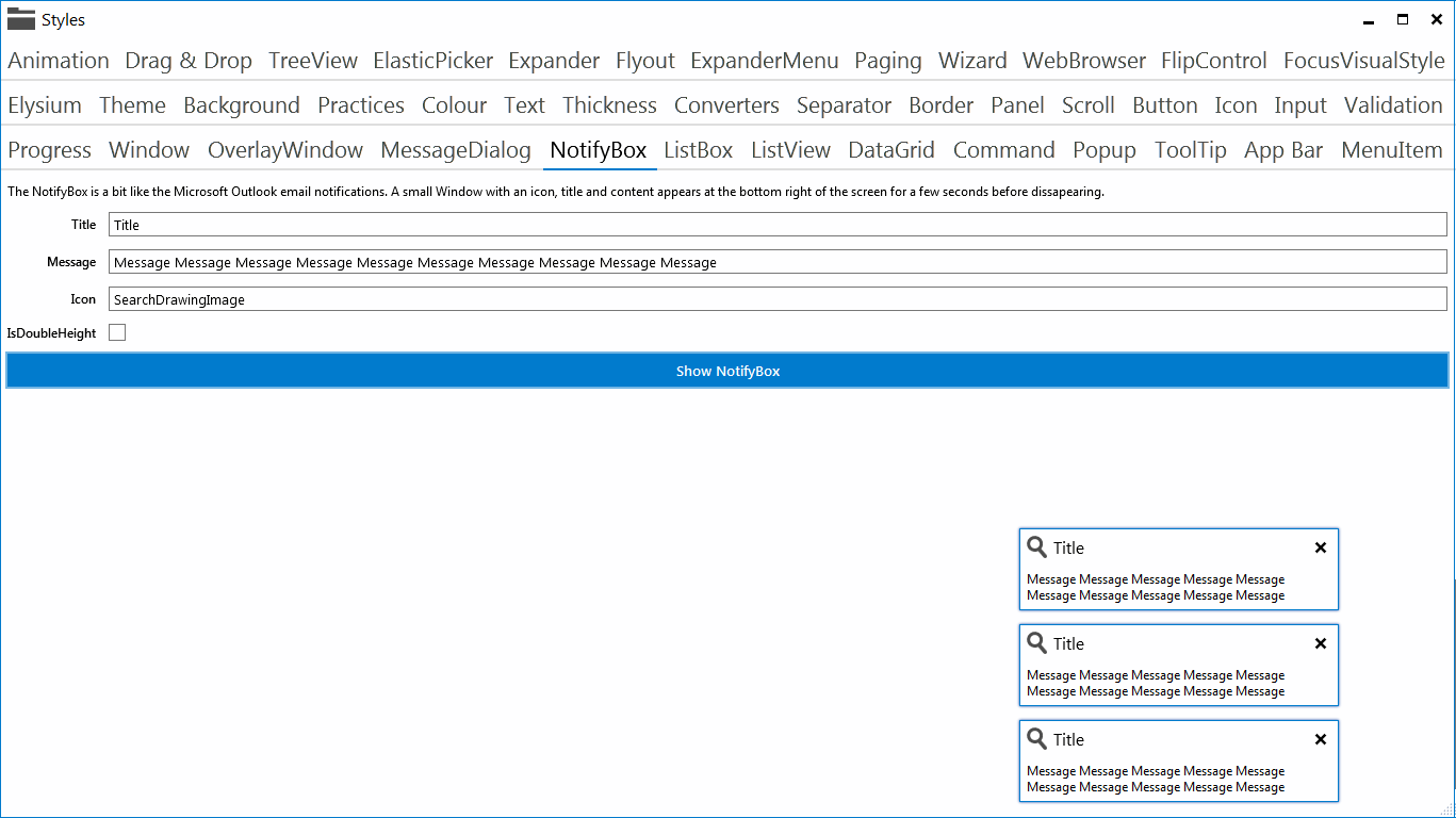
The NotifyBox is like the Microsoft Outlook style email notifications. A small window fades in on the bottom right and slowly disappears, unless you mouse over it.
LoadingContent
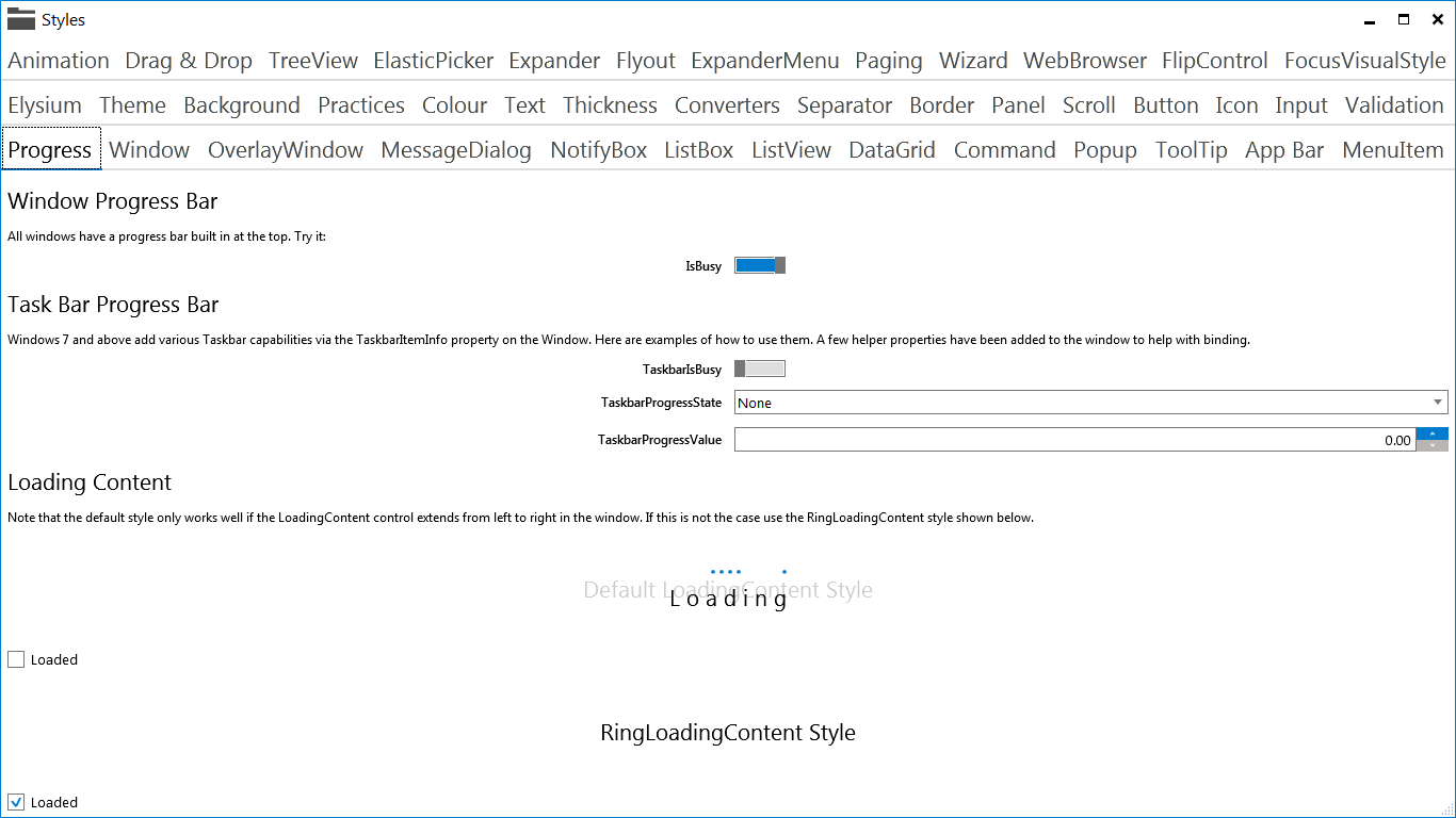
The loading content control can be used to cover any content with a loading animation and loading message. You can toggle it on or off using a simple boolean value.
Paging
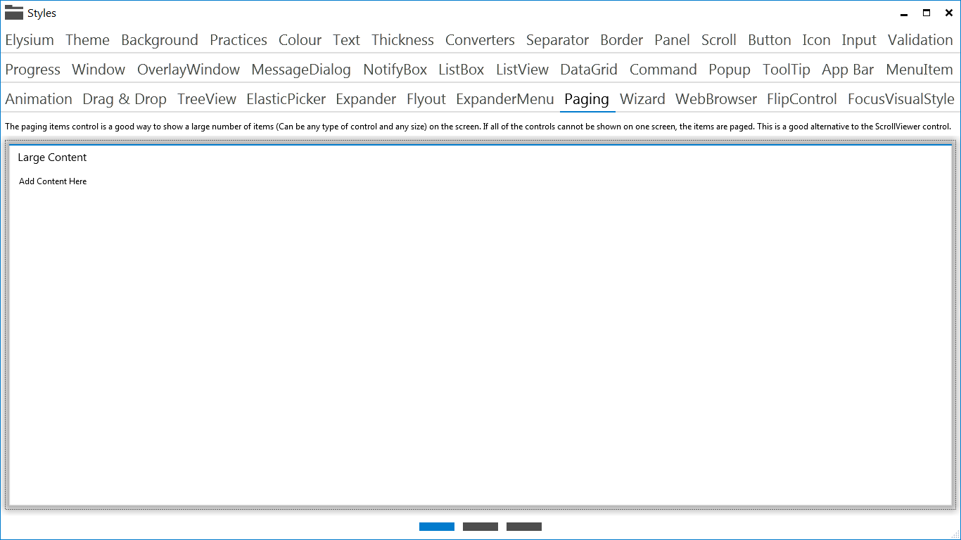
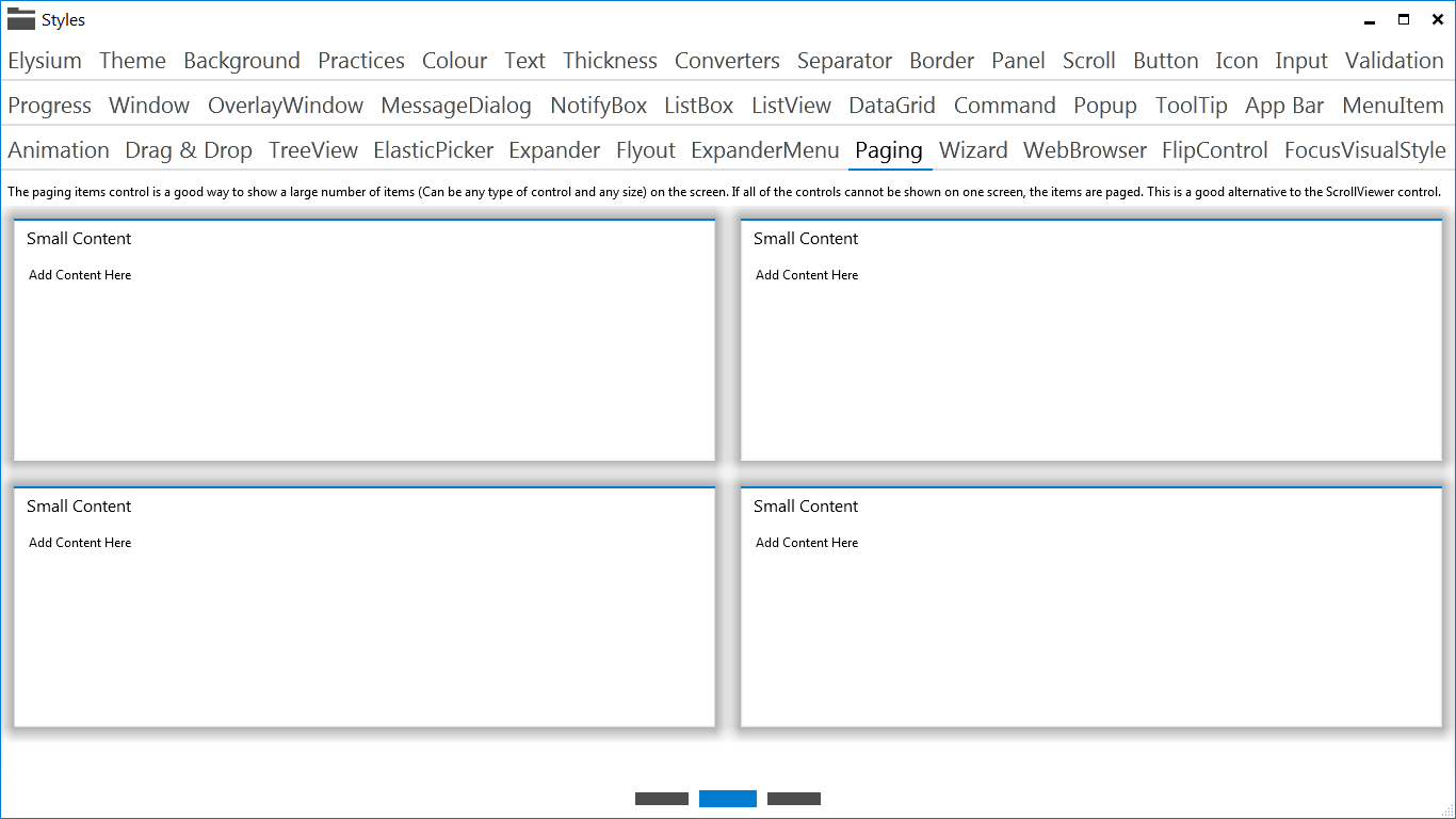
You can add any fixed size content to the Paging control and it will separate it into pages which the user can switch between with a nice transition animation.
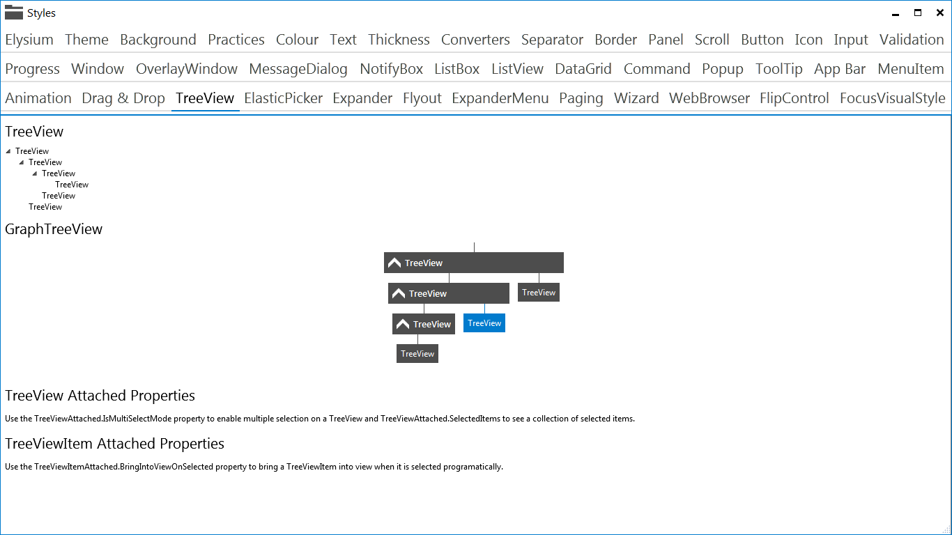
GraphTreeView
The GraphTreeView is just a style for a TreeView, which shows the TreeViewItem's horizontally instead of vertically. In the past I've allowed users to switch between horizontal and vertical views on my TreeView's and users have been pretty appreciative.
Animation Made Easy
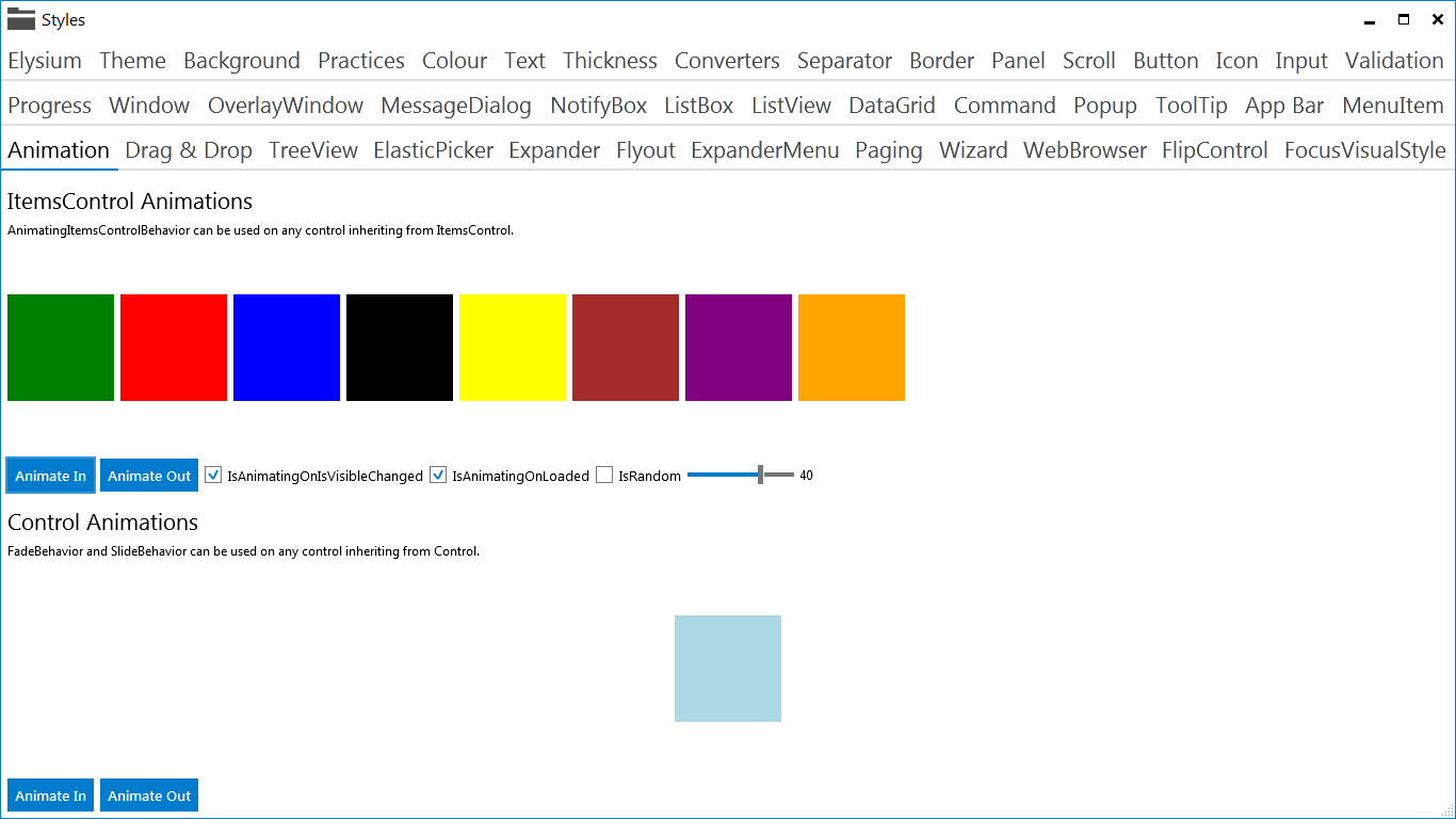
Animating controls has been made simple. All you need to do is add a couple of lines of XAML and your ItemsControl's will fade and slide in sequentially or randomly.
FlipControl
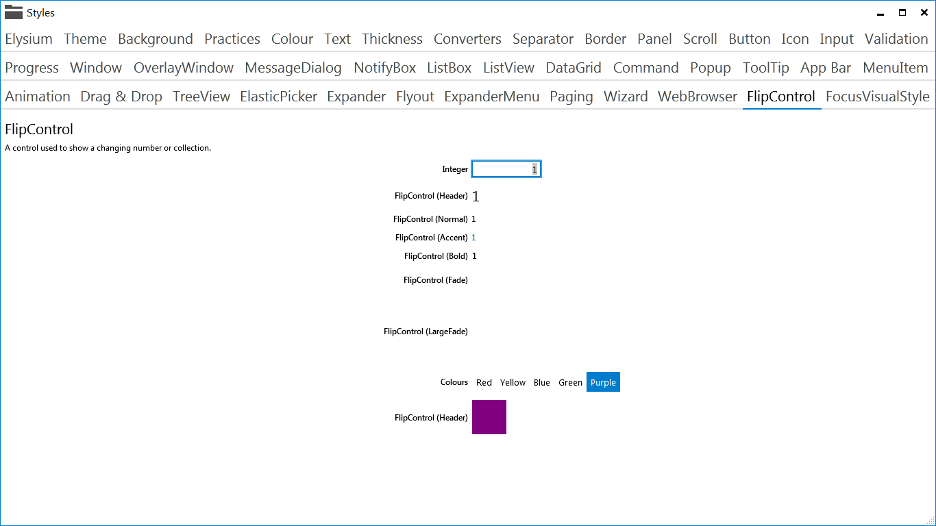
The flip control is basically an ItemsControl which only shows the selected item. When the selected item changes, it flips between the items until it gets to the new selected item.
Various Border Controls
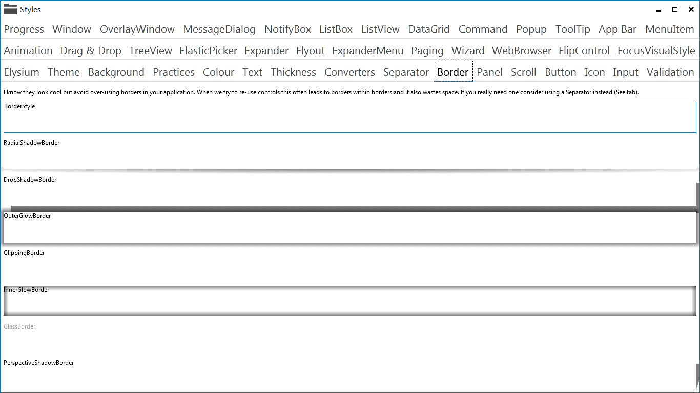
There are several custom border controls available, although usage is discouraged because they are not very metro!
Source Code
The code is available on GitHub and I've tried to keep it up to date with new additions and fixes being made over the weekends.
I have tried to keep the code in keeping with the existing Elysium project, so when controls are moved to the parent Elysium project (I don't know how or when this will happen) this should be a fairly simple process.
The code is fully StyleCop compliant. If you don't use StyleCop or even don't know what it is, I suggest you read this.
If nothing happens in the next couple of months I will start to consider creating a NuGet package, along with all the niceties that make a developers life a little easier.
Conclusions
This is a very young project with currently only one developer but I do intend to keep it working. Your mileage with this SDK may vary but any contributions or bug fixes are welcome.
Comment
Initializing...